
Glenarty Road
Fathoms Cuvée
Fathoms Cuvée
Fathoms Cuvée
We took on the challenge of designing a package for Fathoms Cuvée, a wine not only aged under the sea but adorned with its natural artistry. This wasn't merely about aesthetics; it was about creating a fortress that would protect and celebrate each unique marine masterpiece.
We took on the challenge of designing a package for Fathoms Cuvée, a wine not only aged under the sea but adorned with its natural artistry. This wasn't merely about aesthetics; it was about creating a fortress that would protect and celebrate each unique marine masterpiece.
Year
2024
Industry
Wine
Location
Margaret River, Australia
Services
Brand Positioning Brand Identity Design System Packaging
Background
Background
Background
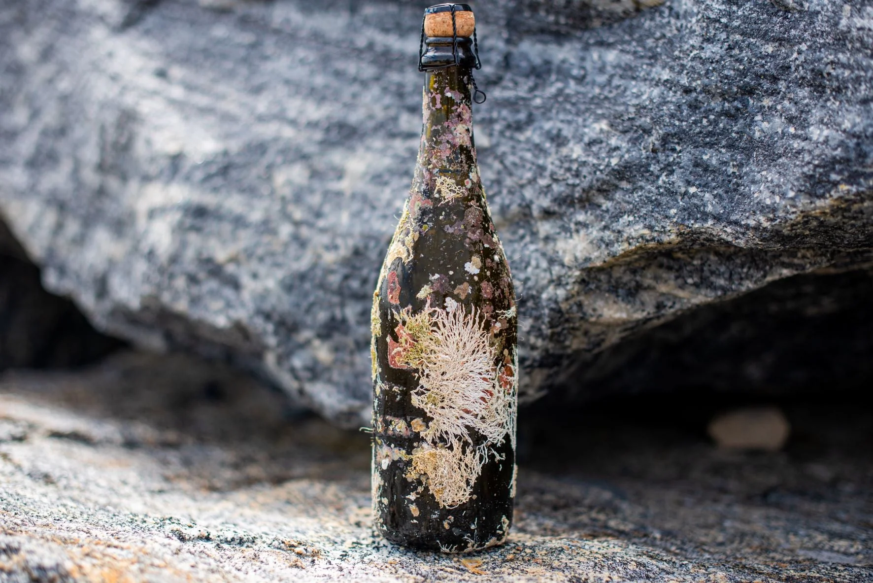
SUBMERGED ORIGINS
Fathoms Cuvée redefines the crafting of sparkling wine with a twist from the deep. This small batch of chardonnay and pinot noir embarked on an oceanic aging journey, submerged ten fathoms deep into the marine currents of Flinders Bay, Augusta, Western Australia. Over thirteen months, each bottle is naturally rocked by the ocean's ebb and flow, instilling a unique complexity and texture that mirrors the rhythmic dance of the sea.

Identity
Identity
Identity
MARITIME TEXTURES The identity is deeply rooted in its maritime saga, adorned with design elements that reflect its oceanic essence. The use a old-world inspired serif wordmark, oceanic photographic textures, moody poetry and a clever use of silver and clear foils inside and out not only enhances the visual depth but also captures subtle reflections reminiscent of sunlight piercing the ocean depths. This interplay of light and texture adds a layer of mystery and allure to the packaging.
MARITIME TEXTURES The identity is deeply rooted in its maritime saga, adorned with design elements that reflect its oceanic essence. The use a old-world inspired serif wordmark, oceanic photographic textures, moody poetry and a clever use of silver and clear foils inside and out not only enhances the visual depth but also captures subtle reflections reminiscent of sunlight piercing the ocean depths. This interplay of light and texture adds a layer of mystery and allure to the packaging.
MARITIME TEXTURES The identity is deeply rooted in its maritime saga, adorned with design elements that reflect its oceanic essence. The use a old-world inspired serif wordmark, oceanic photographic textures, moody poetry and a clever use of silver and clear foils inside and out not only enhances the visual depth but also captures subtle reflections reminiscent of sunlight piercing the ocean depths. This interplay of light and texture adds a layer of mystery and allure to the packaging.
MARITIME TEXTURES The identity is deeply rooted in its maritime saga, adorned with design elements that reflect its oceanic essence. The use a old-world inspired serif wordmark, oceanic photographic textures, moody poetry and a clever use of silver and clear foils inside and out not only enhances the visual depth but also captures subtle reflections reminiscent of sunlight piercing the ocean depths. This interplay of light and texture adds a layer of mystery and allure to the packaging.
A DEPTH OF LAYERS
To embody the fluidity and constant motion of the ocean, Coltskin embossing wraps the package, giving a tactile sensation that evokes the sea's undulating waves. This textural storytelling is paired with a uniquely interactive element: a poem spread across the rear three panels of the hexagonal box. To read the poem, one must gently rotate the bottle from left to right, mirroring the soothing sway of the wine as it rested beneath the waves. This design not only secures the bottle within but also engages the holder, making the experience of unveiling Fathoms Curvee as rhythmic and immersive as its oceanic maturation process.


Our challenge was to develop a visual language for Fathoms that both complements the Glenarty Road brand and distinctively narrates the unique story of Fathoms. This system merges an array of print embellishments and graphic textures to capture the enigmatic depths and dynamic movement of the sea, whilst distinctively showcasing the unique character of each wine.
Our challenge was to develop a visual language for Fathoms that both complements the Glenarty Road brand and distinctively narrates the unique story of Fathoms. This system merges an array of print embellishments and graphic textures to capture the enigmatic depths and dynamic movement of the sea, whilst distinctively showcasing the unique character of each wine.
Our challenge was to develop a visual language for Fathoms that both complements the Glenarty Road brand and distinctively narrates the unique story of Fathoms. This system merges an array of print embellishments and graphic textures to capture the enigmatic depths and dynamic movement of the sea, whilst distinctively showcasing the unique character of each wine.
Our challenge was to develop a visual language for Fathoms that both complements the Glenarty Road brand and distinctively narrates the unique story of Fathoms. This system merges an array of print embellishments and graphic textures to capture the enigmatic depths and dynamic movement of the sea, whilst distinctively showcasing the unique character of each wine.

Outcome
Outcome
Outcome
Outcome
Fathoms Curvee has not only captivated the market but also significantly enhanced the consumer interaction with the product. The thoughtful integration of print embellishments, textures, and poetic motion provides a multi-sensory experience that echoes the wine's unique story, making each unboxing memorable. This design excellence has solidified Fathoms Curvee’s position as a standout offering in the wine industry, celebrated for both its flavour, incredible story and its presentation.
Fathoms Curvee has not only captivated the market but also significantly enhanced the consumer interaction with the product. The thoughtful integration of print embellishments, textures, and poetic motion provides a multi-sensory experience that echoes the wine's unique story, making each unboxing memorable. This design excellence has solidified Fathoms Curvee’s position as a standout offering in the wine industry, celebrated for both its flavour, incredible story and its presentation.

"The Fathoms Curvee project is incredibly close to my heart, and seeing it come to life through TON Studio's brilliant design work has been truly thrilling. Their knowledgable use of materials and design not only respects but elevates our vision. It means so much to have a team that can take our unique story of sea-aged wine and translate it into such a compelling and beautiful product presentation."
Sasha McDonald — Owner + Winemaker